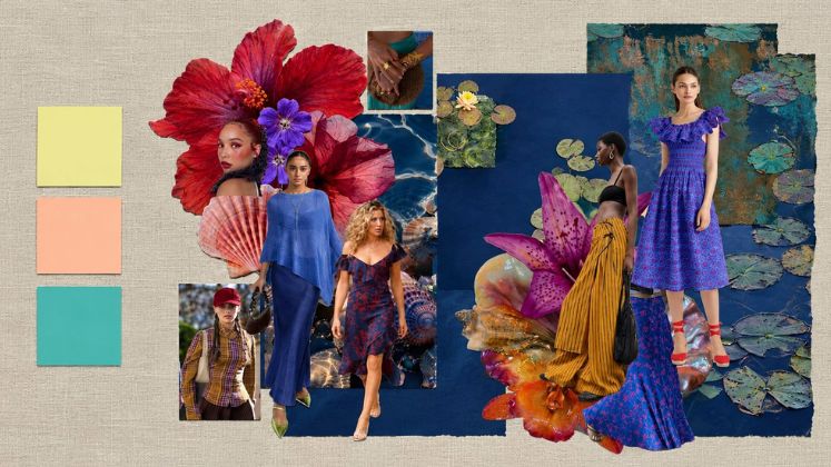
Every autumn/winter season carries its own colour argument, and AW26’s is a genuinely mixed one. Runways from New York to Paris to Mumbai pulled in two directions at once, deeper, saturated tones like wine, bottle green and ochre on one end, unexpected brights like butter yellow, peach and turquoise on the other. Rather than cancel each other out, the two registers ended up defining the season together: darker shades as the wardrobe’s foundation, unexpected colour as the accent that keeps it from reading safe. It’s a palette with more range than fall usually allows, and one that gives Indian labels, many of whom already work in ochre, wine and indigo as house staples, an easy point of entry into the global trend conversation.
Butter yellow has had a similar graph to burgundy, and in fact, it’s been around for longer and just won’t fade out. At New York Fashion Week, labels including Zankov, Sandy Liang, Constantine and Private Policy anchored their AW26 shows around the shade, reinforcing it as one of those colours that proves fall doesn’t always have to be dark; a useful contrast to an otherwise heavier palette.
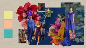
Peachy melon tones and turquoise, meanwhile, are two of the season’s more unexpected picks. The shift has been building since Michael Rider’s debut at Celine and Dario Vitale’s one collection for Versace, both credited with reviving a saturated, 1980s-Miami palette of turquoise, citrus, coral and purple. It’s proof that there are no fixed rules around winter dressing anymore, these tones are meant to be balanced against deeper wardrobe staples rather than filed away as strictly summer colours.
Deep, saturated reds and burgundies dominated Paris and Milan this season. Chanel, Gabriela Hearst and Balenciaga all leaned into variations of the little black dress rendered in burgundy instead, while Alaïa’s velvet suiting paired rich colour with texture in a way that read as knowing rather than clichéd. Erdem and Prada worked berry red against pink in the same warm-toned family, and Jean Paul Gaultier’s Duran Lantink combined wine-coloured velvet with fur in yellow and brown for one of the more dramatic interpretations of the season. Akris showed a striking purple-to-red ombré chiffon dress, keeping purple in the same saturated conversation as wine and cobalt blue elsewhere on the Paris calendar.
At Gucci, Saint Laurent and Tom Ford, the mood shifted toward a more gothic, romantic register like bottle green, ochre, scarlet and purple emerged as the season’s defining colour story, paired with velvet, charmeuse, shearling and leather. Altuzarra, Bottega Veneta and Loewe carried similar tones through slimmer, more polished tailoring, while Rabanne’s Julien Dossena kept the house’s colour-forward identity intact within the same seasonal mood.
Blue took on a cooler, more optimistic role this season, offsetting autumn’s darker registers. Chloé’s Chemena Kamali and Givenchy’s Sarah Burton both used black to ground colour at opposite ends of the spectrum, like pastel icy blue at Chloé, saturated bright yellow at Givenchy, a pairing that read as fresh rather than jarring against a heavier backdrop. Peacock and teal also surfaced across multiple runways this season, part of the same blue-family expansion that’s made turquoise feel current again rather than purely a summer colour.
Indian runways picked up a parallel thread at Lakmé Fashion Week x FDCI’s March 2026. Blue and white emerged as the season’s defining combination there: Payal Pratap worked deep indigo into denim and tailoring, Abraham & Thakore explored the pairing through architectural, sari-inspired separates, and AFEW by Rahul Mishra brought it into eveningwear with heavily worked gowns.
Elsewhere on the calendar, the palette skewed earthier. Anamika Khanna’s AK|OK moved through fluid neutrals into browns, reds and blacks; Abrol Studio’s Countrymade collection worked faded olives, scorched browns and oxidised bronze; and Vivek Karunakaran opened the week with earthy, dhoti-based silhouettes in brown silk. Manish Malhotra, Masaba Gupta, Tarun Tahiliani, Amit Aggarwal, Punit Balana and Kartik Research rounded out a season that, per house tradition, balanced heritage craftsmanship with a more wearable, ready-to-wear sensibility than in past editions. Raw Mango added an international dimension of its own, taking its Fall/Winter 2026 collection to London Fashion Week in February, while its Festive 2026 line, Bhitti Chitra, drew on fresco and mural art for a muted, classical colour story.
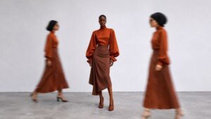
Fall foliage tones have particular resonance in Indian design, where they’ve long been part of the existing vocabulary rather than a seasonal import. Sabyasachi’s bridal and occasionwear has worked in deep ochre and burnt-orange silks for years, and Raw Mango’s textile-led collections regularly sit in the same tonal family through hand-dyed cottons and silks. Anavila’s linen separates have explored muted mustard and rust in recent seasons, offering an easy template for translating the trend into everyday fabrics.
That crossover is visible beyond occasionwear too. Nicobar already carries an ochre trouser in its current line, and Bombay Shirt Company’s rust-toned cotton-linen shirting applies the same palette to menswear casualwear rather than statement dressing. Fabindia’s newly launched premium sub-brand, Fabels, unveiled in June and built around natural fabrics and handcrafted textures, is another label where an ochre or rust colourway would sit naturally.
It’s interesting how fall colours aren’t about being season-specific anymore, and are slowly becoming much more personal. So the way to go for AW26 dressing is clear: keep the neutrals and the browns in place, then bring in a touch of reds, blues, yellows and unexpected brights — international and Indian runways this season point in exactly the same direction.
India’s fashion calendar isn’t governed by the same hard seasonal breaks as New York, London, Milan or Paris as festive and wedding cycles carry more commercial weight than literal weather. But the colour logic translates well on both ends of the palette. Ochre, mustard and rust already perform commercially through festive-to-wedding stock cycles, so brands can reposition existing bestsellers within a global trend narrative rather than introducing an entirely new palette. At the same time, deep reds and indigo-blue already anchor much of India’s autumn-winter retail assortment, giving room to layer in butter yellow, peach and turquoise as accent shades; a lower-risk way for Indian labels to signal global colour currency without alienating core occasion-wear buyers.