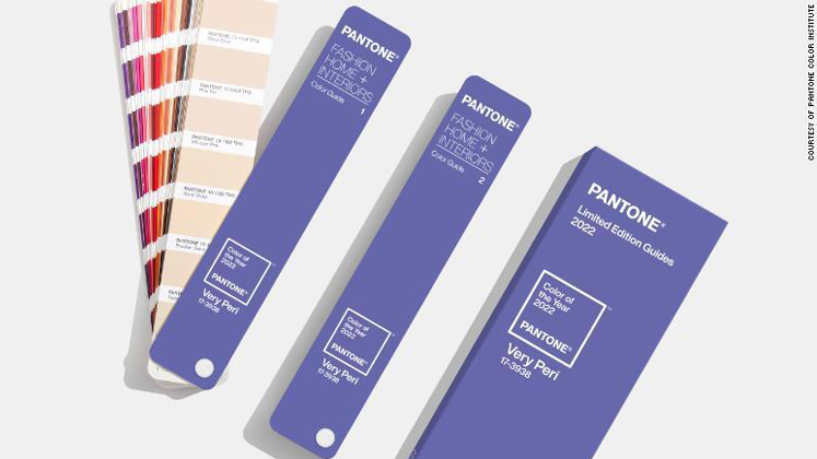
‘VERY PERI’ is Pantone’s 2022 colour of the year.
It is described by Pantone as the “happiest and warmest of all the blue hues,” a “dynamic periwinkle blue hue with a vivifying violet-red undertone.” It combines the faithfulness of blue with the energy and excitement of red.
As per Pantone, “Very Peri helps us to embrace this altered landscape of possibilities, allowing to ‘rewrite our lives’ as we emerge from isolation.”
Pantone said that the shade is inspired by the rising artistic community in the digital space and gaming. In other words, it’s all about inventiveness and stretching the limits of reality.
Pantone Color Institute’s Executive Director Leatrice Eisema said, “It was really important for us to come up with a new colour, because we have a very new vision of the world now.”
“It is literally the happiest and the warmest of all the blue hues,” she added, describing the shade. “Because of that red undertone, it introduces an empowering feeling of newness, and newness is what we’re looking for.”
Each year, Pantone attempts to interpret the zeitgeist through the lens of colour theory – mining the likes of fashion, design and interiors for clues.