The Fall Winter 2026 season unfolds against a backdrop of cautious optimism, where consumers are recalibrating their wardrobes with a sharper focus on longevity, emotional value, and versatility. This season, purchasing behaviour reflects a more considered approach, wherein consumers gravitate towards fewer, better products that justify their price through durability, adaptability, and perceived investment value.
This has led to the rise of “elevated essentials” and statement pieces that can seamlessly integrate into existing wardrobes while offering a sense of novelty.
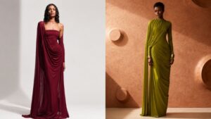
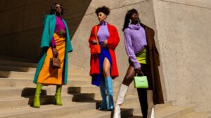
Colour plays a pivotal role in driving this balance, with Transformative Teal emerging as a foundational “new neutral,” offering depth without the predictability of black, while purple introduces emotional resonance through a spectrum that ranges from grounding plums to expressive lilacs. In contrast, fuchsia Pink injects controlled energy, appealing to consumers seeking visibility and optimism without compromising wearability, while gold reflects a renewed appetite for reassurance and asset-driven luxury, extending beyond jewellery into readyto-wear and accessories through considered detailing.
Print and surface design follow a similar trajectory of evolution rather than disruption with classics such as heritage plaids and polka dots being reworked through scale play, layering, and softened executions, allowing familiarity to coexist with experimentation. Meanwhile, animal print takes on a new vibe with Bambi-inspired prints while Winter Florals signal a move toward tactility and narrative depth.
For brands and manufacturers, the opportunity lies in precision-delivering products that feel both emotionally engaging and commercially grounded at the same time.
PURPLE REIGN
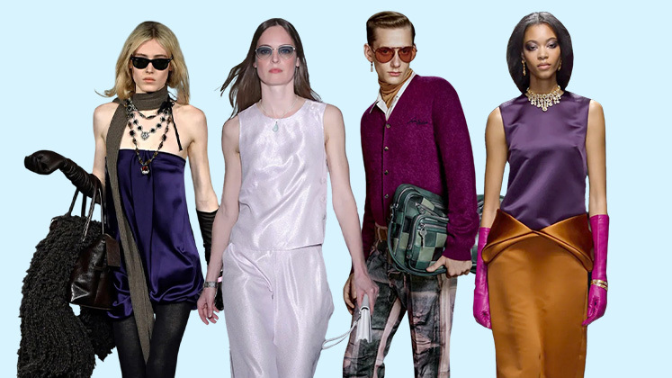
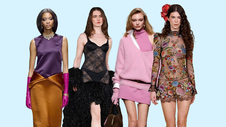
Purple establishes itself as a defining colour for Fall Winter 2026, expanding across a nuanced spectrum that moves from saturated, wine-inflected tones to lighter, more luminous lilacs.
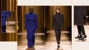
Runway validation across New York, Paris, and Milan underscores its commercial viability, where designers deployed purple to deliver controlled drama that was impactful yet measured, bold yet wearable. Market data further reinforces its upward trajectory. Womenswear sees strong growth across Plum and Muted Berry in the EU, alongside steady gains in Mauve and Sangria Purple in the US. In menswear, Eggplant and Vivid Purple signal a growing confidence in colour across tailoring and smart-casual categories.
For brands, the opportunity lies in treating purple as a layered spectrum. Deep plum and oxblood variants translate seamlessly into wool overcoats, corduroy tailoring, and leather outerwear, enhancing the season’s tactile richness, while softer tones such as mauve, muted berry, and lilac, lend themselves to knitwear, brushed flannels, and fluid satins, offering accessible entry points across markets.
In menswear, eggplant suiting, tonal layering, and vivid knitwear grounded in neutrals create a balanced proposition, while accessories such as scarves, gloves, footwear, and handbags, serve as low-risk vehicles for adoption, enabling retailers to build momentum while responding to increasing consumer openness toward expressive colour.
TEAL THE DEAL

Teal cements itself as the season’s most strategic colour investment, bridging the familiarity of dark dressing with a renewed sense of depth and modernity.
Positioned between deep blue and aquamarine green, the hue delivers both richness and clarity, making it a compelling substitute for black across categories. Its medium saturation and trans-seasonal adaptability align closely with the industry’s ongoing shift toward longevity and reduced consumption cycles.
Data-backed momentum ranging from increased retail share of dark tones to rising digital engagement, signals strong commercial viability. More importantly, teal’s classification as a “coloured dark” enables it to function as a wardrobe anchor without the predictability of black, opening up opportunities for differentiation at scale.
Designers can expect to ace this trend by translating this into elevated essentials, think tailored trousers, ribbed turtlenecks, structured coats, and leather separates, where teal replaces core neutrals rather than acting as an accent. Textural depth is key with brushed wool, compact knits, and high-shine finishes enhancing its visual impact. Brands should look at positioning teal as a foundational merchandising colour, supported by tonal styling or grounded with earthy neutrals.
BAMBI
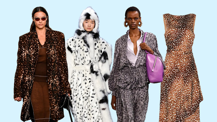
Animal print is undergoing a decisive recalibration for Fall Winter 2026, moving away from the sensuality and high-contrast aggression of leopard, zebra, and snake prints towards a more nuanced, naturedriven narrative.
The emergence of deer-inspired “Bambi” prints defined by dappled fawn spots in warm ochres, softened whites, and sunfaded tans, signals a softer, more atmospheric direction. First noted at Tory Burch’s Autumn Winter showcase in New York, this woodland-coded motif introduces a sense of calm and emotional grounding, aligning with the broader shift toward tactility and restraint seen across recent seasons.
Unlike its predecessors, this print is less about a statement and more about subtle immersion. For brands, this opens up opportunities to reframe animal print as a sophisticated neutral rather than a bold accent. Outerwear, particularly shearlinglined coats, wool overcoats, and quilted jackets, offers a strong entry point, while fluid dresses, midi skirts, and relaxed tailoring extend its relevance into ready-to-wear.
Execution should prioritise softness in both palette and fabrication. Brushed cottons, suedes, jacquards, and wool blends enhance the organic feel, while tonal layering ensures commercial wearability. Accessories, including scarves, handbags, and footwear, provide scalable adoption with the key lies in restraint, positioning Bambi print as an elevated texture rather than a loud motif.
FUCHSIA FRENZY
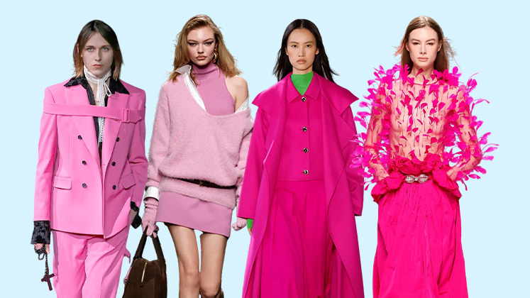
Fuchsia pink enters Fall/Winter 2026 as a strategic statement colour, redefining bold femininity through a lens of controlled intensity.
However, its success lies in balance. Instead of overpowering the narrative, fuchsia performs best when it is grounded and styled against utilitarian neutrals such as khaki, charcoal, or deep browns, creating a commercially viable contrast that tempers its vibrancy. This makes it particularly relevant for occasionwear, evening separates, and fashion-forward daywear capsules.
On the international runways, designers and brands have showcased fuchsia pink’s versatility across diverse styling narratives – at Alaïa, it appeared in the form of a knitted skirt with asymmetric pleating that climbed the leg emphasising both movement and structure, while Chloé tempered its vibrancy through puff-sleeved crop tops paired with grounded khaki skirts. Silhouettes play a crucial role in its adoption with directional shapes such as asymmetric skirts, sculpted knitwear, cropped tops, and fluid draped dresses allowing the colour to feel intentional rather than excessive. For brands and designers, the focus should be on saturated dye techniques across knits, silks, and performance blends to ensure colour richness and longevity.
WINTER IN BLOOM
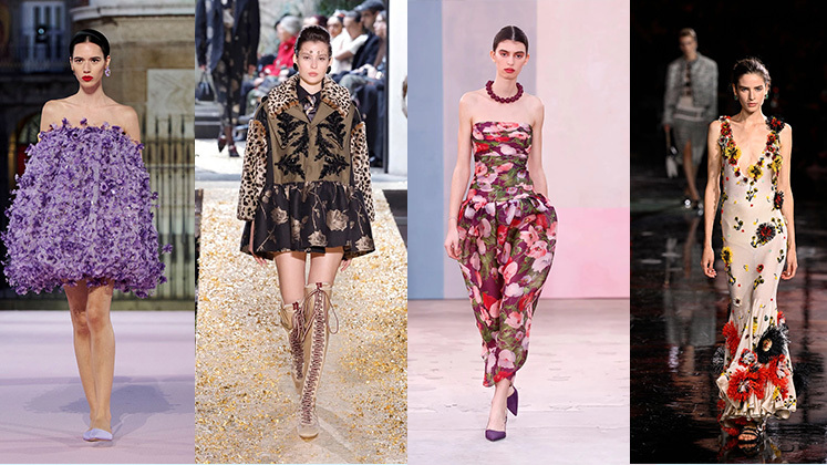
This season, florals transition from decorative surface to structural statements that are driven by a shift toward tactility and material innovation. At Matthieu Blazy’s debut for Chanel, florals were no longer confined to print, but instead, emerged as sculptural elements crafted through appliqué, layered organza, intricate embroidery, and fabric manipulation. Petals lifted off garments, adding depth and movement, while embellishments such as beadwork and crystals injected a refined sense of opulence. These dimensional florals appeared across blouses, dresses, and accessories, redefining texture as the central narrative
Running parallel, botanical prints continue to evolve as a complementary direction. Leaves, vines, and organic motifs rendered in both painterly and graphic styles, offer a flatter, more accessible interpretation, suitable for broader market adoption.
For designers and brands, the opportunity lies in balancing these two approaches. High-fashion capsules can explore exaggerated, three-dimensional florals through pleating, gathering, and embroidery, particularly within occasionwear and statement pieces, while commercial lines can leverage botanical prints across dresses, shirting, and tailored separates.
Fabric choice is critical- think organza, tulle, jacquards, and textured blends that amplify dimensionality, while placementdriven design ensures visual impact without excess.
CHECKED IN
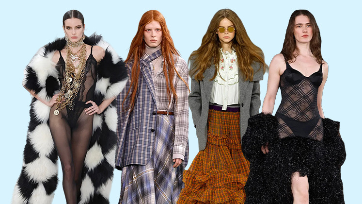
Plaid returns as a cornerstone print for the approaching Fall Winter 2026 season, reaffirming its position as a reliable commercial driver while undergoing subtle yet impactful reinvention. Rooted in tradition, tartan and heritage checks continue to anchor autumn collections, but this season’s direction moves beyond classic replication towards softened, reinterpreted surfaces that feel contemporary and design-led.
Runway cues, notably from Etro, signal this evolution through layered storytelling where traditional plaids are overlaid with florals, introducing depth and unexpected contrast. Simultaneously, blurred and diffused linework offers a modernised take on checks, softening their graphic rigidity and making them more adaptable across categories.
In the retailscape, market response remains strong, with buyers continuing to prioritise plaid as a dependable yet versatile print, particularly when refreshed through innovative treatments. For brands, the opportunity lies in balancing familiarity with novelty.
Core pieces such as wool coats, tailored suits, capes, and scarves should retain classic check structures, while experimentation can be introduced through scale variation, colour overlays, and mixedmedia applications.
GOLD MINE
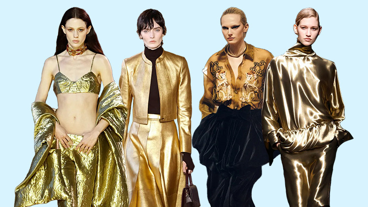
After seasons dominated by restraint and muted metallics, gold reasserts its dominance for Fall/Winter 2026 as both a material and a mindset, signalling stability, permanence, and a recalibrated appetite for visible luxury.
The rich hue’s resurgence is closely tied to macro sentiments, where consumers are gravitating toward pieces that feel enduring, valuable, and emotionally reassuring. Within this, yellow gold leads the narrative, its warm tonality aligning with the broader revival of 1980s glamour codes and a renewed interest in decorative, highshine detailing.
Designers are moving beyond nostalgic references, positioning gold at the intersection of heritage and modern investment. This is mirrored in the rise of the pre-owned luxury market has further reinforced its intrinsic value, while leading houses are embedding credibility through recycled metals, traceability systems, and ethical sourcing, elevating gold from a purely aesthetic choice to a conscious one.
For brands, the opportunity lies in integration rather than excess. Gold is no longer confined to jewellery; but is being embedded across categories. Hardware-led detailing such as statement buttons, belt buckles, exposed zips, and chain embellishments offers a commercially viable entry point. Structured handbags with brushed gold finishes, layered chain belts over tailoring, and gold-accented footwear introduce polish to otherwise understated looks.
In the ready-to-wear segment, designers should look at exploring metallic threads, fluid fabrics, and controlled lamé applications, particularly within eveningwear capsules. The key to making this trend work for your brand is precision – using gold to elevate and anchor collections, ensuring it reads as refined investment rather than decorative overload.